The brand will reveal the values and motivations of the organization, both openly stated and hidden. What makes a company unique and what services does it provide? What does the brand stand for, exactly? But why is it special? These foundational and timely concerns have been and will continue to be, prioritized by the business as it works to build its brand. In terms of aesthetics, branding entails far more than simply a constantly evolving, on-trend presentation. When reorganizing drastically, it’s important to reevaluate the brand’s visual identity, the visible embodiment of many minute details.
An organization’s space should convey the values that it upholds. Employer branding tells a narrative. It’s an opportunity to design a space that showcases the brand. A company’s brand values are also reflected in every design feature and expression, and they are woven throughout the narrative.
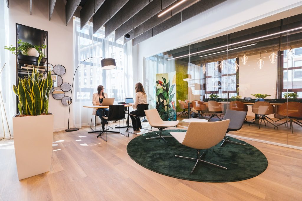
Successful workplace design is as much about function as it is about innovation across industries—each with its own unique lines of business, procedures, and corporate principles. Today, a lot of businesses want the best of everything when it comes to workplace design, taking into account the varied generational makeup of the workers who actually use space. However, having everything does not imply having it equally. Decisions must always be made during the design process. Companies must prioritize their values in order to envision an environment where employees can deliver on the brand promise. This will serve as a guide for those.
Distinctive Appearance – I Notice Something You Miss
Simply put, a company’s visual identity is the sum total of its customers’ emotional associations with the brand. We at Upscale Spaces understand the importance of details like a “dress code” that may not be immediately noticeable, or an office’s custom design that is in keeping with the company’s ethos. Both Apple and Nike have recently unveiled striking new headquarters complexes, featuring futuristic architecture that reflects the companies’ respective ethoses. Apple Park in Silicon Valley, which cost five billion dollars and was built by the renowned London company Foster + Partner, is one of the most sustainable and cutting-edge office campuses in the world. Apple’s reputation for incorporating cutting-edge technology into sleek, modern designs makes the circular form factor a natural fit.
Nike’s New York City headquarters has an indoor basketball court and plenty of room for brainstorming, therefore the company is popular in the city. Nike’s new corporate headquarters reflects the company’s embrace of the communal ideals inherent in numerous sports. This building serves as a visual embodiment of the Nike brand.
The Vore of a Thought
A logo is the foundation of any and all visual identities. When it comes to the brand’s visual identity, the logo is just the beginning. You can see the flames, but the real fire is underneath. Graphic logos are designed and summarized as the essence of a firm and its principles, while typographic logos are based on a font as a so-called word mark. It’s important for a logo to be memorable and to convey the essence of the firm in a few simple lines. Of course, a logo can’t possibly represent the entire intricate ethos of the organization, but it can (and should!) distill that ethos down to its essentials. Even though the startup world moves quickly, Page learns from a few examples that it’s crucial to put some thought and imagination into the logo design process. To best represent Upscale Spaces, our logo is a unique combination of typography and images. We at Upscale Spaces believe in the power of community and strive to cultivate joyful settings for your everyday life. We asked ourselves important questions like, “Who is the logo aimed at?” and “What information needs to be expressed and planned in particular?” when developing the brand. Graphic designers have the difficult duty of creating a logo that is both visually striking and memorable, while also paying close attention to the smallest of details. The ideal logo, whether it’s visually or typographically oriented, has a high recognition value and doesn’t quickly get lost in the unending logo sea, the alphabet of the city.