When choosing curtains for a residential space, all the focus shifts to how they can compliment our interior palette. As an interior designer, experience silently whispers on how to be cautious when balancing aesthetics and functionality. At this point, the aim becomes to match curtains directly with walls or furniture. In fact, that’s why opting for complementary tones elevates the room’s overall design. Curtains that harmonize rather than replicate the existing color scheme bring depth, balance, and adaptability. This allows them to blend into the aesthetic while adding visual interest. Such an approach offers flexibility, creating a cohesive look aligning with both the space’s functionality and mood.
Well, here the illustrative considerations to help you make the best choice for an inviting yet a layered interior.
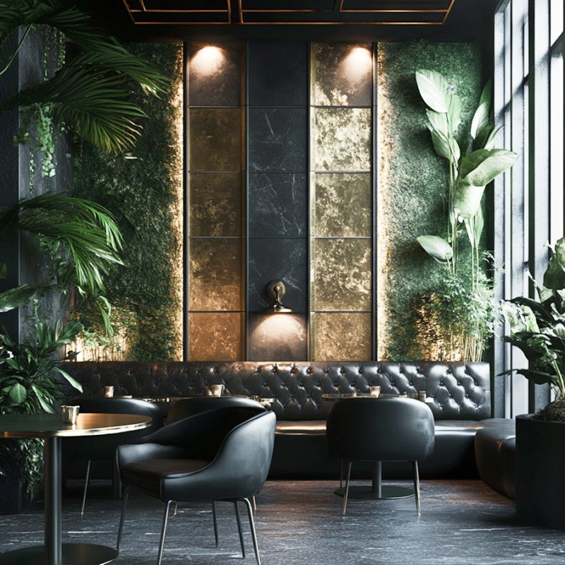
Residential Interior Palette Considerations
The Role of Curtains as Complementary Design Elements
Curtains are generally seen as secondary elements meant to support the room’s primary color scheme. Once used well, they’ll help to balance and soften the space. Complementing color sets such as;
- Navy Blue & Burnt Orange,
- Forest Green & Blush Pink,
- Deep Teal & Coral,
- Maroon & Gold
- Soft Aqua & Peach,
- Indigo & Warm Amber
These combinations offer flexibility which allows curtains to work as transitional pieces between various shades in the room. Using this technique creates a layered effect which evidently feels natural and inviting. For instance; Having a room with light blue walls and white trim, choosing curtains in a deeper navy blue or soft gray anchors the space without overwhelming it. Such complementary shade emphatically boosts the wall color while bringing depth. Its also attaches in with furniture or accessories of similar hues.
Creating Harmony without Exact Matching Colors
- Subtle Contrast: Here, the secrete is using a shade that is a few tones darker or lighter than the walls. By comparison, it adds a dimension without clashing. This approach is effective when you want a balanced look that doesn’t draw attention to the curtains as a focal point.
- Accentuation through Color Families: You have to select curtains which fall within the same color family but differ in warmth or coolness. For instance, in a room with beige walls, taupe or warm gray curtains can subtly enhance the color scheme. They provide enough difference to keep the look interesting. In another case, a neutral-toned living room with beige walls and brown accents, taupe curtains can blend effortlessly while adding a layer of sophistication. By all means, the room feels richer without detracting from other elements.
The Impact of Textures in Complementary Curtains
- Playing with Fabrics: The fabric choice also affects how well curtains complement the space. Lighter materials like linen blend well in casual or coastal-themed residential, whereas velvet or silk enhances formal or luxurious interior palette.
- Patterned vs. Solid: A subtle pattern introduces complementary colors that pull in tones from the surrounding décor. Remember, patterns should generally be chosen with care. Why? Simply because they work well in rooms with solid-colored furniture or walls, thus preventing visual overload.
For example: In a bohemian-styled bedroom with earthy tones, patterned curtains in a mix of rust, olive green, and off-white can capture the room’s natural palette without replicating any single color. This choice complements the décor as well as adding both depth and personality.
Complementing Your Residential Room’s Function and Mood

Matching Interior Curtains with Bedroom Color Palette

Matching Curtains with Living room Color Palette
- Bedroom: In spaces meant for relaxation, curtains that complement the color palette but are slightly muted (like dusky blues, soft grays, or creamy whites) encourage a calm ambiance.
- Living Room: For social areas, use curtains capable of introducing a subtle pop or a darker tone within the palette. This tactic provides a sense of balance without detracting from the room’s energy or warmth.
- Kitchen: Kitchens benefit from lighter, easy-to-maintain materials in tones that enhance natural lighting. These may include; complementary whites or light grays that match the cabinetry or backsplash.
The Visual Height and Depth Impact of Complementary Curtains
Your choice on complementary curtains also affects the perception of space. If its a floor-to-ceiling curtains in a slightly darker shade than the walls, then expect a visually elongated the room. Besides, a lighter tone within the palette makes the space feel airy and open.
For instance: In a small room with pale gray walls, charcoal or slate gray curtains perfectly provide the right balance. They make the room feel more spacious and grounded without clashing.
Residential Interior Palette Adaptability with Seasonal Demands
Now take a case like here in Dubai, the climate is characterized by extreme heat in summer and milder temperatures in winter. If there are already recommendation for a cool solution to Dubai office heat, then what about our homes? This significantly influences home decor choices which eventually includes curtains. Now, the task here is deciding on what curtains to use for the summer versus winter season.

-
Summer Season
While outdoor temperatures can exceed 40°C (104°F), the focus shifts to keeping indoor spaces cool and comfortable. The sand-colored curtains come in to allow natural light to filter through. They keep the space bright as well as reflecting the warm sunlight which later contributes to a cooler ambiance.
-
Winter Season
As winter approaches, temperatures in Dubai become pleasantly mild. How sweet is that? They really offer a chance to enjoy outdoor living. To adapt the residential interior palette for the season, here is what you might introduce. That includes, the rich and earthy tones such as deep terracotta or olive green in decor elements like rugs and artwork. The soft sand-colored curtains still fit beautifully, providing warmth and coziness without clashing with the new seasonal accents. This approach allows the curtains to remain a staple throughout the year, easily adapting to the changing decor while enhancing the room’s overall aesthetic.
Ready To Renew Your Residential Interior Palette?
Whether your intention is revamping specific rooms or full home renovation and remodeling, take these considerations. You’ll correctly match curtains to any interior color scheme. You’ll create a clean and coordinated look within your residential space. Since curtains simply add a nuanced layer of design, they’ll enhance the room’s depth, texture, and functionality. To reflect your unique style and transform your living space into a welcoming haven, DesignMaster interior design contractors in Dubai are here. Visit us today to discover the ideal residential curtains and interior palette that can beautifully complement your home!