Neutral color palettes are the cornerstone of timeless and versatile residential interior designs. The soft whites and beiges have always been the most common for creating a calming and inviting ambiance. Now its 2025, we can shift the yard stick to prioritize the muted grays and earthy browns to widen our residential neutral color collection. With the neutral shades serving as a perfect backdrop, DesignMaster is here to guide you on which residential neutral color that can perfectly highlight key interior design elements. Certainly, it can be furniture or artwork, so long as it maintains a cohesive and elegant residential look. If you’re aiming for a minimalist aesthetic or a more layered and textured space, this is meant for you.
Here is the trending list of residential neutral palettes tested and approved for when flexibly crafting balanced and refined living spaces.
Top 6 Trending Residential Interior Neutral Color Palettes
-
Warm Earth Tones
These bring a sense of coziness and connection to nature in residential interior design. Warm earth toned colors are renown for evoking warmth and comfort which makes spaces feel inviting and lived-in. In fact, their earthy essence aligns with the increasing focus on sustainability and biophilic design. To use them, pair earth tones with neutral shades like cream or beige to maintain balance. Otherwise, layer them with natural materials like wood, stone, and woven textures for a cohesive, organic feel. Their versatility allows them to complement a variety of styles, from rustic and traditional to modern and bohemian, making them a timeless choice for creating a warm, grounded atmosphere.
Key Colors: Clay beige, terracotta, soft ochre, sandstone, clay, and deep browns

Best Applications:
- Designing living rooms and dining spaces where warmth fosters social interaction.
- Accent walls or large furniture pieces like sofas or sideboards.
- Pairing with greenery to emphasize natural themes.
-
Soft Grays with Green Undertones
These hues are versatile and certainly adapt to both modern and classic styles as they calmly connect to nature. While soft grays with green undertones bring a subtle sophistication, they also offer a fresh alternative to traditional neutrals. When styling your living space, pair these tones with crisp whites for contrast. Otherwise, consider natural wood works and stone accents so as to enhance their organic appeal. For hardware and fixture decor, use metallic finishes like brushed nickel or matte gold which enhance the elegance of these tones. Soft grays with green undertones also harmonize well with indoor plants. With this strategic selection, you’ll create a serene and cohesive residential interior that feels refreshing yet understated.
Key Colors: Misty gray, sage grey, rosepine, Evergreen fog, Paris rain and silver green.

Best Applications:
The green undertones easily adapt to both cool and warm interiors. This demonstrates their capability to work beautifully in minimalistic and Scandinavian inspired spaces. Use them in;
-
Deep Taupe and Mushroom Tones
Deeper neutrals offer a modern alternative to traditional beiges. This means deep taupe and mushroom tones explicitly add depth and elegance to residential interiors while maintaining a soft, neutral appeal. These shades, with their rich and velvety subtle tones of gray, brown, and beige, create a warm and sophisticated backdrop. Isn’t this what perfectly complements a variety of design styles? To use them effectively, pair them with lighter neutrals like cream or white for contrast. Conversely, accentuate with metallics and textured fabrics to add richness. So, leverage their understated charm to create cozy, timeless, and effortlessly stylish interiors. Don’t forget to combine them with textured wall panels or matte finishes for an enhanced contemporary appeal.
Key Colors: Mocha taupe, Warm stone, Mink, Deep taupe, mushroom beige, and cocoa brown.

Best Applications:
- Study rooms or home offices to promote focus and comfort.
- Upholstery and interior curtains for a cohesive, elevating luxurious feel.
- Accent colors in modular kitchens paired with matte black fixtures.
-
Subtle Pink-Neutrals
Looking to add a delicate personality and refreshing warmth in your residential interiors? Then go for subtle pink-neutrals. Contrast these shades with warm metallics like rose gold or copper for a contemporary touch. Since these shades feature a blend of soft blush and beige, they create a serene and inviting atmosphere without being overtly feminine. During your residential fit out project, combine them with crisp whites for a clean, airy feel. You can also layer with deeper tones like charcoal or navy for a more dramatic and balanced contrast. Their versatility and softness make them a perfect choice for offering a modern interior twist on classic neutral palettes.
Key Colors: Blush beige, dusty rose, pale mauve, soft rose Barely There, warm peony and muted peach.

Best Applications:
Subtle Pink-Neutrals work seamlessly with both bold colors and muted accents, therefore ideal for designing bedrooms as well as living rooms. Then include them in;
- Nurseries and children’s rooms for a soft and welcoming vibe.
- Accent furniture like ottomans, cushions, or throws.
- Layered with white and cream for a fresh, airy look.
-
Crisp Whites with Subtle Undertones
Crisp whites with subtle undertones, such as hints of blue, gray, or cream, remain a timeless choice for creating bright and open spaces. They refine a versatile elegance of residential interiors by creating a bright and airy atmosphere. Using them in a living space feels so open and inviting yet still maintaining a polished aesthetics. In like fashion, they boost the visibility of textures and architectural details as customizing undertones (blue, yellow, or pink) suits different lighting conditions. To use them effectively, pair them with contrasting textures like wood, metal, or stone to add depth. You can also layer them with soft fabrics for a cozy yet sophisticated look.
Key Colors: Chalk white, alabaster, and ivory.

Best Applications:
- Entire walls for a clean, expansive feel.
- Ceiling designs, trims and moldings and architraves to frame rooms elegantly.
- Kitchens and dining areas for a crisp with hygienic aesthetic.
-
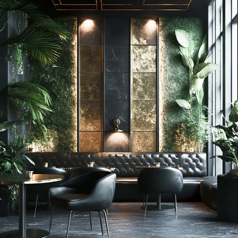
Charcoal and Greige
Charcoal and greige (a blend of gray and beige) are a dynamic duo in luxury Villa interior designs. You know why? Its is simply because they offer a perfect balance of boldness and subtlety. Since charcoal adds depth and drama to spaces, it makes an excellent choice for defining a moody sophistication. On the other hand, greige provides a warm and neutral base which softens the overall look. During your residential interior design, incorporate soft lighting to counteract the darker tones and create a cozy atmosphere. In other words, effectiveness is experienced by pairing charcoal with lighter greige tones. This way, you can maintain balance and prevent the space from feeling too dark.
Key Colors: Ash gray, warm grey, stormy charcoal, Deep Charcoal and greige (gray-beige).

Best Applications:
Combing Charcoal and greige together creates a modern palette that works well in living room design, bedrooms, and kitchens. So, apply them in;
- Modern living rooms or media rooms.
- Feature walls for a bold statement.
- Complementary backdrop for colorful artwork or bold furniture or cabinetry.
Please note that colors shown on digital screens may vary due to different monitor types and settings. Visit us to navigate our wide collection of color palettes and have their real-world appearance.
Looking for a Personalized Residential Interior Neutral Color Palettes?
Neutral color palettes in 2025 are far from monotonous — they are versatile, timeless, and designed to adapt to evolving lifestyle needs. It’s okay to favor the warmth of earth tones, the sophistication of grays, or the airy lightness of whites. Here in Dubai its so important to maintain the growing focus on sustainable living which encourages earthy interior spaces. For that reason, DesignMaster interior design contracting company offers free consultation and guidance on what neutral color and how to implement them in residential fit out. Contact us now regarding your residential projects if your ambitions are to lead the design trends with thoughtfully blended textures, materials and interior decor.